The New York Times 2.0
In an era where so many issues occur, It has become so important for people to be interested in the news. However most media brands has digital interfaces in a form of traditional newspapers. As modern users process visuals faster and remember them more efficiently than text, they prefer visual content and feel difficult to read long articles.
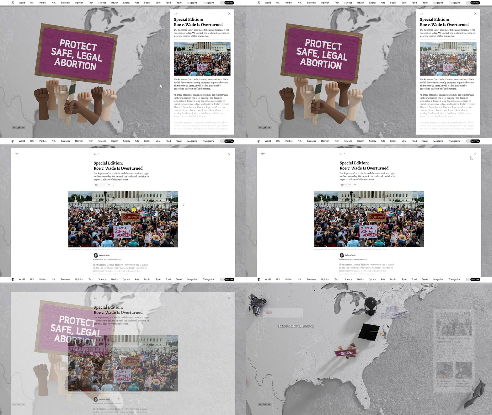
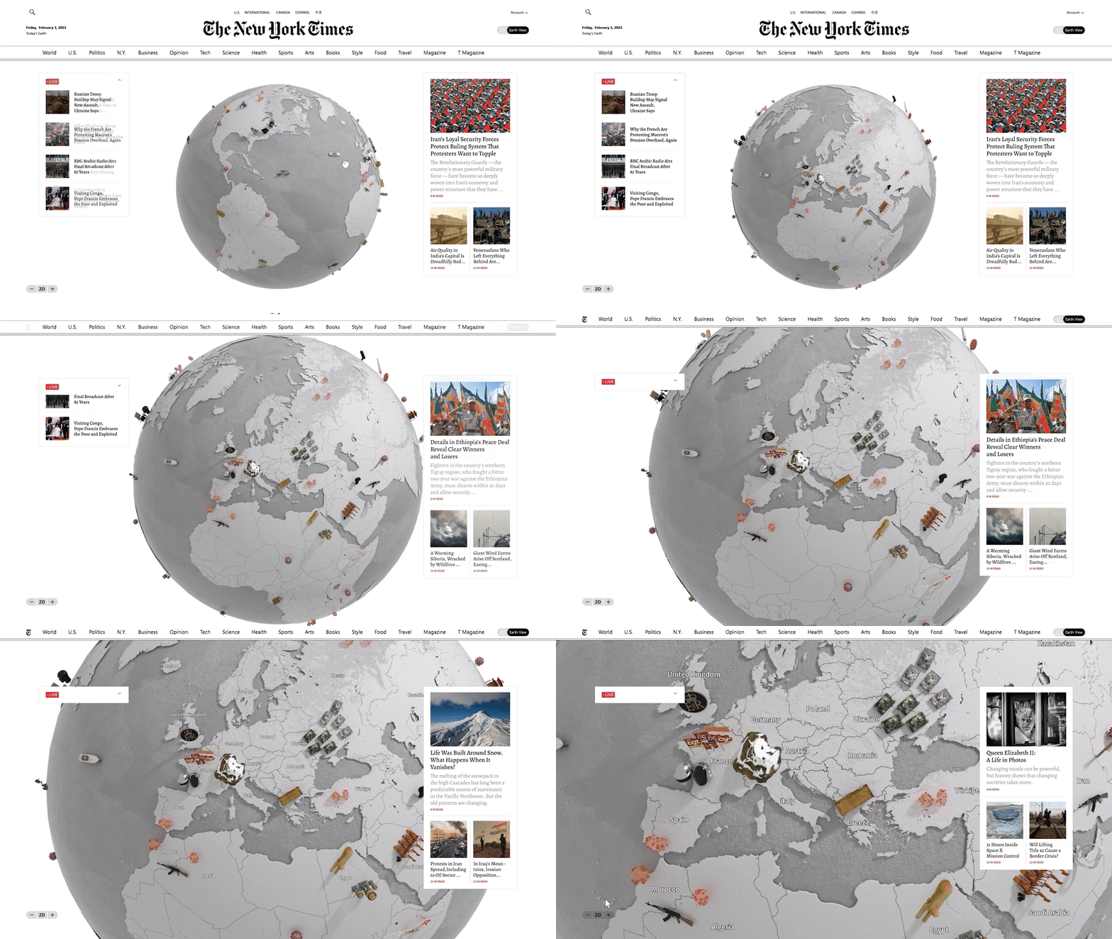
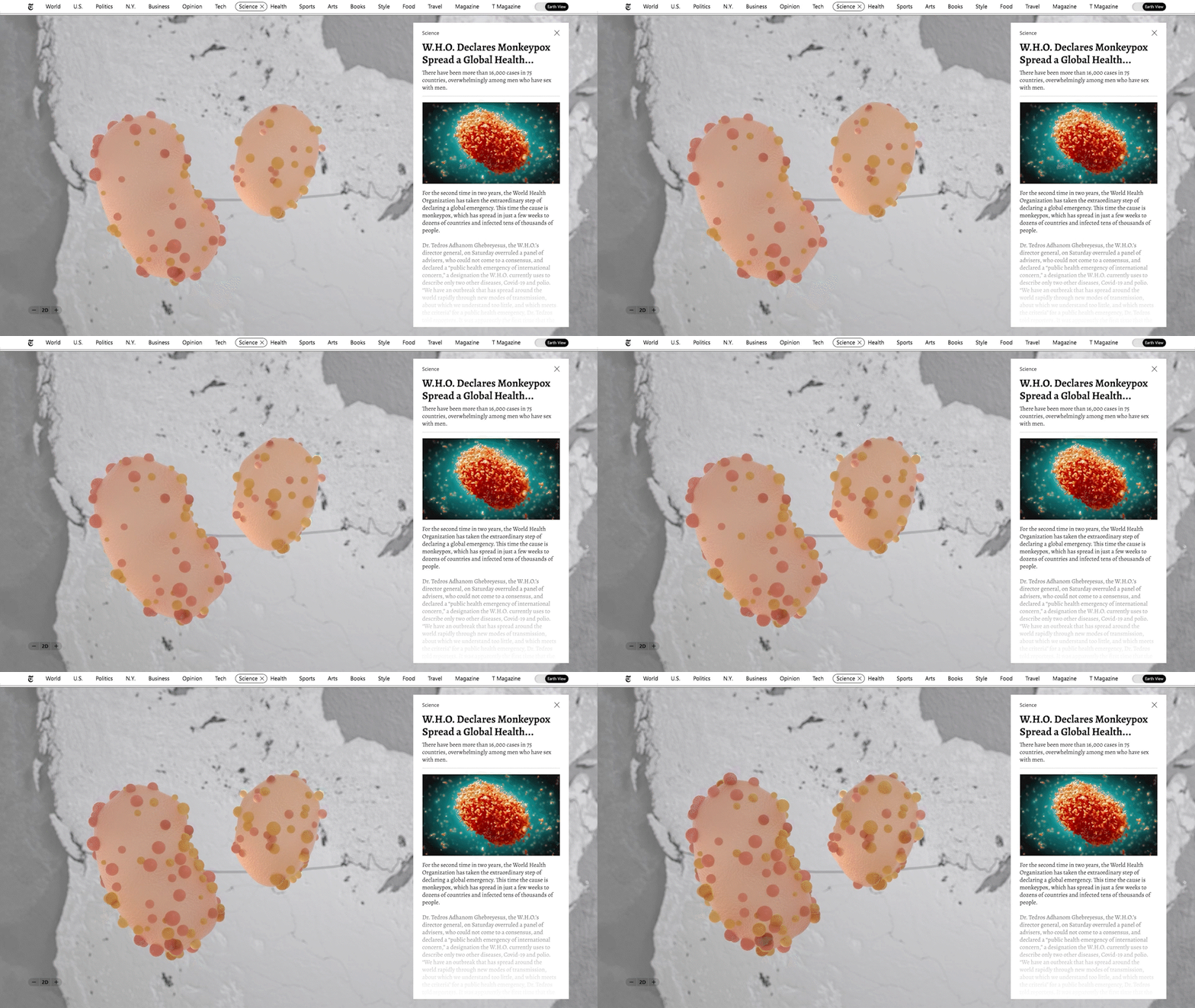
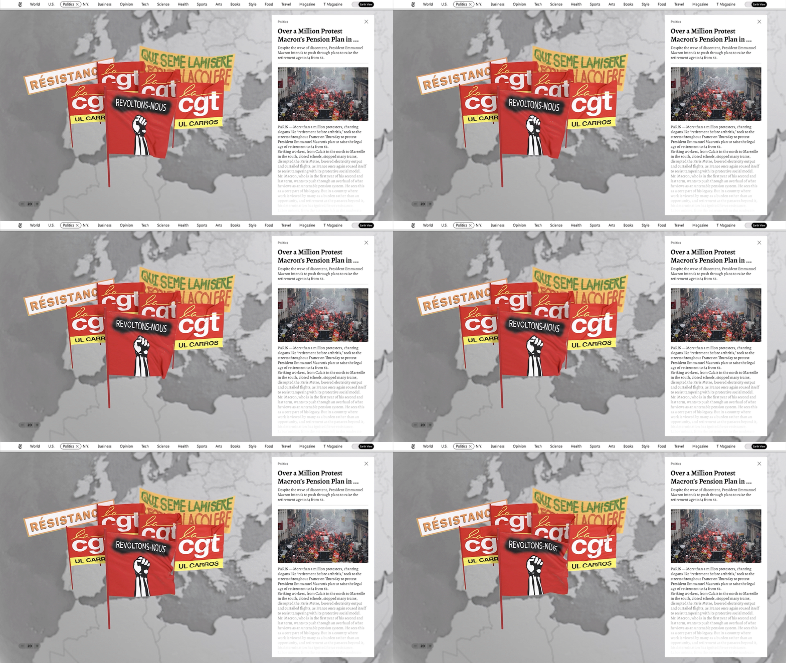
So The New York Times presents an innovative interface that allows users to experience news in a new way. Switching a toggle to Earth view, all articles will be visualized on the interactive globe. It will be a first step for people to be interested in the news and actively participate in world affairs.
Client
The New York Times
Role
Concept, Art Directing
Recognition
Young Ones ADC 2023
Gold Cube | Interactive - UX/UI
Bronze Cube | Interactive - Online/Mobile Website
Newyork Festivals
Gold | Interactive & Navigation (UX/UI)
Gold | Branded Content / Entertainment
Clio Awards 2023
Bronze | Student Branded Entertainment & Content - Digital/Mobile
Bronze | Student Digital / Mobile - Website
Bronze | Student Digital / Mobile & Social Media Craft - User


